
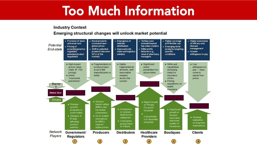
When my clients are pitching to investors, some of them suffer from “information overload”. They include so much detail on each slide that their audience literally takes none of it in.
This is the opposite of what you want to happen.
Back to Basics
During my pitch coaching intensives, I always spend a couple of minutes reviewing the basic rules of slide presentations.
A lot of it may seem obvious, but you’d be surprised by how even the smallest mishap – like a typo – can negatively impact your pitch.
Rule #1: “If they’re reading the slide, they’re not listening to you.”
- We think and process 800 words a minute.
- We read and process 400 words a minute.
- We speak and process 100 words a minute.
Do the math: if they’re reading the slide, they’re not listening to you.
If you have too many words on your slide, they can read it four times faster than you can read it to them.

Rule #2: ONE idea per slide.
When you’re doing a 5, 10 or 15-minute pitch, remember, the less you give them on the slide, the better.
Only share ONE IDEA PER SLIDE. Not two or three. They’re not going to be able to remember it.
They can read all the details in your backup investment deck. What they’re really buying—and what you’re really selling here—is YOU.
You are the focus of your pitch, not your slides! Your slides are just there to support you.
Rule #3: Bullets are good. Headlines are better. Images are best.
- Good slides use only short, short bullet points.
- Better slides show just the headline and an image or two.
- The best pitch deck slides have only an image.
Think of your slides as a container for each idea. The images are there to provide a metaphor, to enhance the meaning of your idea.
Choose images that are memorable, but not too busy – you don’t want them to detract from what you’re saying.
When all you have is an image on your slide, you can superimpose a number.
Just make sure your audience is walking away with ONE key idea.
5 more rules to consider when you build your PPT presentations
- Use large font. Ideally, 24-48 point.
- Your deck needs to be branded and consistent in look and feel. Pay attention to formatting, font size, typeface, color, and alignment. Every slide should appear as part of the same story.
- Only use simple transitions between slides, and not too many animations. Try to stick to 1-2 clicks per slide. Animate to reveal important information, or bullet points one-by-one (if you’re heavy on text). Build dramatic effect. But never let it become a distraction.
- When you’re highlighting a certain idea or figure, magnify the area you want to talk about and mask or fade out the rest. Make it easy for your audience to zoom in on the one key point you want to address.
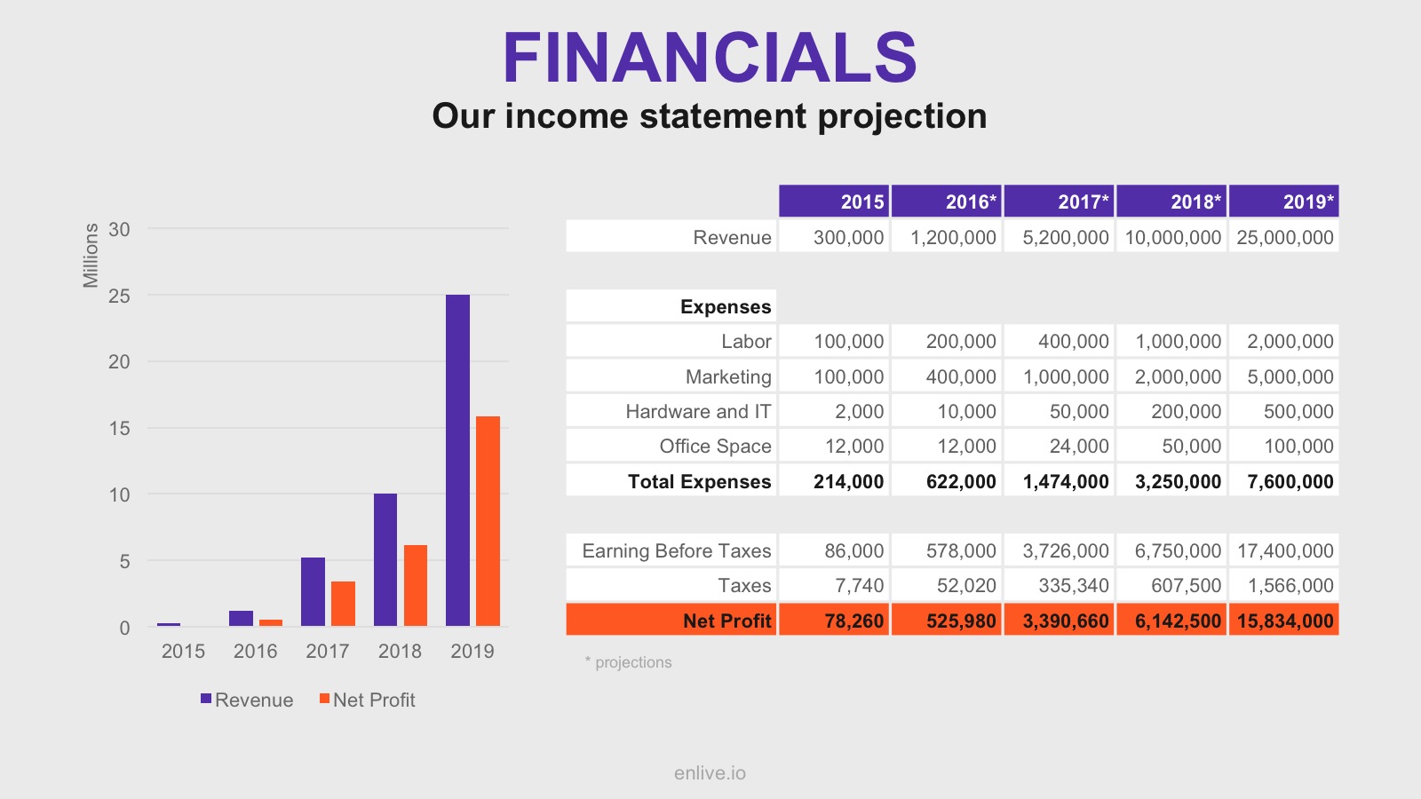
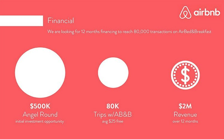
- If you include charts or graphs, keep these as simple as possible. Only show the essence of the information you want to convey, such as trends, results or outcomes. Show the big numbers; skip the details. Airbnb offers a good pitch deck example of what to do. See the difference?
When you’re trying to squeeze a lot of valuable information into a 5-minute pitch, I understand how hard it can be to know what makes it in, and what you need to cut. Read my article “Murder Your Darlings” for more about this.